Anne Arundel Medical Center was able to reduce their opioid prescribing by over 60% through a series of interventions that relied heavily on their dashboards.
The organization set up the public goal of achieving a 50% reduction in an 18-month period from the initial announcement. After that first and most broadly sweeping goal, their opioid task force set up the following goals:
- 50 percent reduction in MME prescribing – publicly announced
- Reduction in prescribing variation – internal only
- Maintain patient satisfaction with pain management – internal only
“You potentially could get bogged down in the mindset that I just can’t even get started until our dashboard is ready. … That didn’t match our experience. We brought the task force together and started evolving the analytics as the needs of the task force solidified. … That led to our initial dashboard.”
Dave Lehr, CIO, Anne Arundel
Source: “A Journey to Opioid Prescribing Reduction,” CHIME webinar, July 2018
Initially, this organization focused on the Emergency Department by creating a dashboard with just two simple metrics:
- Total MME’s prescribed – broken down by provider and for the whole department
- Total MME per encounter for each provider
Using these two simple metrics, the Opioid Task Force was able to prove their performance improvement methodology. In addition to the overall health system goal of a 50 percent reduction in prescribing, the ED set the sub-goal of reducing their variability between prescribers. Below you can see, visually, how this metric evolved over time.
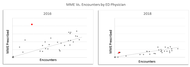
Here, both the slope of the line (Total MME) and the standard deviation from the line were reduced. And in showing the provider represented by the red dot above that he was a significant outlier from his peers, the provider quickly learned that his practices were not normal and adjusted. This visual management technique is what the dashboard is intended to facilitate: critical conversation supported by data.
This also highlights the importance of the Stewardship Committee’s leadership of the effort. The data alone will not drive change. Only leaders within the committee can make that happen, using the data as a tool.
Over a short period of time (less than three months), the Anne Arundel opioid dashboard grew from those humble beginnings to a full enterprise-wide view of all opioid prescribing, as led by the committee. The top priority metrics that they included were as follows:
- Patient/Community Outcomes
- Patient satisfaction with pain management in the ED
- Chronic pain prescribing vs. prescribing for opioid naïve patients
- Calls for second prescriptions to measure the effectiveness of EPCS
- Pills prescribed but not used, reported by patient’s patient portal and follow-up visits
- Also captured the reason for taking (many took pills without experiencing pain)
- County data on overdoses in the community
- Prescribing volume
- Total MME, median MME per encounter, number of encounters with opioid prescriptions, number of patients with prescriptions
- All broken down by service line, prescriber, department, patient geography, etc.
- Duration of use
- Median pills/MME per patient, pills/MME per order
- Inter-departmental prescribing variability
- Outliers per procedure (which OB gives the most pills for a C-Section, for instance)
- Protocol compliance (percentage of procedures with a departmentally established pain protocol that deviate from the protocol)
- MME within 24 hours of discharge as a predictor of how much the patient needs after discharge.
It’s also worth noting that in the process of setting up the dashboard, the Anne Arundel team began putting the framework in place to toggle the dashboard from opioids to benzodiazepines. This will begin driving new initiatives at their organization using the same framework.
The Anne Arundel team started their work earlier than many other organizations, so most of their dashboard tools were built custom in-house. Their team cautions, though, that since they did their work, a lot of out-of-the-box functionality has been released by their vendors. They believe that if they began the work today, they could accelerate their work with a simple call to their EMR support representatives who could help them configure pre-released tools.
Keys to Success
- Develop the dashboard in partnership with initiative leaders in the Opioid Steering Committee or Opioid Task Force to incorporate their perspectives and ensure buy-in
- Set goals and let them determine the design and functionality of the dashboard
- Begin modestly with a few metrics to prove the performance improvement methodology
- Ensure the dashboard provides clear and irrefutable data to support change management
- Build off your successes to include more metrics and initiatives
- Using out-of-the-box solutions prove to be faster than building custom in-house tools