Chapter II

Creating Your Dashboard

Background

Chapter 1 focused on strategies for creating an Opioid Stewardship Committee, with examples from an academic medical center, large healthcare systems and a critical access hospital. Based on the experience of these organizations and many other health systems, it’s safe to say that an Opioid Dashboard is one of the first deliverables that the Opioid Stewardship Committee will need. The dashboard will play a critical role as a tool to view and monitor performance metrics and present other relevant data. However, it is very important that the dashboard is delivered in partnership with the committee—not as a prerequisite to the creation of the committee. Many initiatives fail to launch while business intelligence teams toil at creating perfect dashboards without the input or buy-in of the initiative leaders.

This is not to say that the IT leader won’t do some homework leading up to the initial meeting of the Opioid Stewardship Committee. It is important for the informaticist to guide and ground the committee in what can be done using reasonable goals and measurements. Just as the medical directors should do literature review before heading into the meetings, the IT leaders should have a firm grasp on:

  • What their vendors provide out of the box
  • What their team has the ability to customize
  • What technologies and metrics have been successful at other organizations

This chapter of the playbook will walk you through those considerations. But before you get started, you need a clear idea of your organizational goals for this initiative.

Setting a goal

Most of the organizations we surveyed had the following among their key goals:

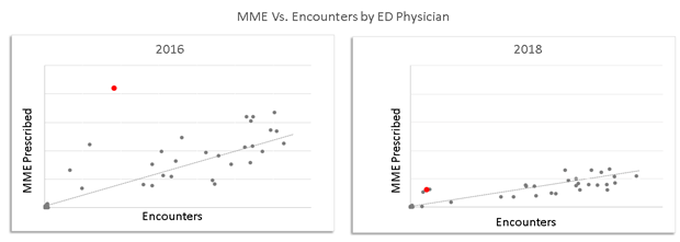
Invest in the future health of our community by reducing the pipeline into addiction. This requires us to reduce the total Morphine Milligram Equivalents (MMEs) that are prescribed, especially for opioid naïve patients.

Whether your organization chooses this as one of its goals is up to the discretion of the committee. But let’s use this as an example.

In this case, you haven’t built a dashboard to try and dictate the goal. Instead, you’ve waited for your committee to set this goal first and offer further definitions of exactly what you should be measuring. In this example, we’re not just measuring the total MME, but we also want the ability to drill down on a subset of patients who are not yet addicted. Now that you have this definition, you can begin working on the reports and dashboards that will track this metric in lockstep with the actual effort of the committee.

Start Building

At some point fairly early in the effort, you’ll notice that you have a handful of working metric definitions that tie to the Stewardship Committee’s goals. It’s highly advisable to document these definitions so that users can easily understand what the dashboards are telling them. It also helps the credibility of the dashboard to know that the definitions were discussed and agreed among medical and operational leaders.

Now that you’ve got a working set of your first few metrics, it’s time to start building! Keep these high-level goals in mind:

  • Measure your baselines
  • Track progress
  • Break down the progress to functional areas
  • Do a strong wave of data validation with your operational counterparts
  • Create the framework for your clinical leaders to have conversations with their teams

Key Insight

The ultimate way a dashboard drives change is by enabling conversations. Create a dashboard that allows medical directors to have a conversation with physicians about normal prescribing practices, outlier situations, and standard protocols. Without these conversations, change can’t happen.
A common practice among successful organizations we surveyed for this chapter was their dashboard was an ever-evolving work. New functionality was continuously added throughout the initiative. This meant when they first started, they were able to publish some initial data, make an operational change, publish new data, and continue the cycle until the dashboard and the initiative were mature. You may recognize this as a sort of “Agile development” method, where a small product is delivered initially and then improved until it becomes mature. This method appears to be common among dashboard builders who succeeded in their Opioid Reduction initiatives.

Governance

Just like most big initiatives, you will quickly encounter the situation where there are more good ideas than resources to build dashboards and technologies to support the ideas. That’s OK! It just needs to be well managed, and your experience as an IT leader has already given you the solution to this problem: Governance.

The teams we surveyed commonly had a process in place that allowed them to prioritize the ideas generated in the Stewardship Committee and rank them by the estimated opportunity. They also were able to specify to the committee how many IT FTEs were available for the initiative. These two inputs allowed the technology and operational teams to have the same set of expectations as they worked through the queue of ideas in priority order.


Real World Examples: Anne Arundel

Anne Arundel Medical Center was able to reduce their opioid prescribing by over 60% through a series of interventions that relied heavily on their dashboards.

The organization set up the public goal of achieving a 50% reduction in an 18-month period from the initial announcement. After that first and most broadly sweeping goal, their opioid task force set up the following goals:

  • 50 percent reduction in MME prescribing – publicly announced
  • Reduction in prescribing variation – internal only
  • Maintain patient satisfaction with pain management – internal only

“You potentially could get bogged down in the mindset that I just can’t even get started until our dashboard is ready. … That didn’t match our experience. We brought the task force together and started evolving the analytics as the needs of the task force solidified. … That led to our initial dashboard.”

Dave Lehr, CIO, Anne Arundel

Source: A Journey to Opioid Prescribing Reduction,” CHIME webinar, July 2018

Initially, this organization focused on the Emergency Department by creating a dashboard with just two simple metrics:

  • Total MME’s prescribed – broken down by provider and for the whole department
  • Total MME per encounter for each provider

Using these two simple metrics, the Opioid Task Force was able to prove their performance improvement methodology. In addition to the overall health system goal of a 50 percent reduction in prescribing, the ED set the sub-goal of reducing their variability between prescribers. Below you can see, visually, how this metric evolved over time.

Here, both the slope of the line (Total MME) and the standard deviation from the line were reduced. And in showing the provider represented by the red dot above that he was a significant outlier from his peers, the provider quickly learned that his practices were not normal and adjusted. This visual management technique is what the dashboard is intended to facilitate: critical conversation supported by data.

This also highlights the importance of the Stewardship Committee’s leadership of the effort. The data alone will not drive change. Only leaders within the committee can make that happen, using the data as a tool.

Over a short period of time (less than three months), the Anne Arundel opioid dashboard grew from those humble beginnings to a full enterprise-wide view of all opioid prescribing, as led by the committee. The top priority metrics that they included were as follows:

  • Patient/Community Outcomes
    • Patient satisfaction with pain management in the ED
    • Chronic pain prescribing vs. prescribing for opioid naïve patients
    • Calls for second prescriptions to measure the effectiveness of EPCS
    • Pills prescribed but not used, reported by patient’s patient portal and follow-up visits
    • Also captured the reason for taking (many took pills without experiencing pain)
    • County data on overdoses in the community
  • Prescribing volume
    • Total MME, median MME per encounter, number of encounters with opioid prescriptions, number of patients with prescriptions
    • All broken down by service line, prescriber, department, patient geography, etc.
  • Duration of use
    • Median pills/MME per patient, pills/MME per order
  • Inter-departmental prescribing variability
  • Outliers per procedure (which OB gives the most pills for a C-Section, for instance)
  • Protocol compliance (percentage of procedures with a departmentally established pain protocol that deviate from the protocol)
  • MME within 24 hours of discharge as a predictor of how much the patient needs after discharge.

It’s also worth noting that in the process of setting up the dashboard, the Anne Arundel team began putting the framework in place to toggle the dashboard from opioids to benzodiazepines. This will begin driving new initiatives at their organization using the same framework.

The Anne Arundel team started their work earlier than many other organizations, so most of their dashboard tools were built custom in-house. Their team cautions, though, that since they did their work, a lot of out-of-the-box functionality has been released by their vendors. They believe that if they began the work today, they could accelerate their work with a simple call to their EMR support representatives who could help them configure pre-released tools.

Keys to Success

  • Develop the dashboard in partnership with initiative leaders in the Opioid Steering Committee or Opioid Task Force to incorporate their perspectives and ensure buy-in
  • Set goals and let them determine the design and functionality of the dashboard
  • Begin modestly with a few metrics to prove the performance improvement methodology
  • Ensure the dashboard provides clear and irrefutable data to support change management
  • Build off your successes to include more metrics and initiatives
  • Using out-of-the-box solutions prove to be faster than building custom in-house tools


Real World Examples: Geisinger & Other Notable Examples

Geisinger Health System is another example that paralleled the insights offered by Anne Arundel. Their system also began with the publicly stated goal of a 50 percent reduction in prescribing. They, similarly, achieved a reduction of over 65 percent as of the time of this publication.

Their journey had many similarities to the previous case study, but they added that there were some key factors they measured that weren’t included in Anne Arundel’s dashboard.

Some of those key metrics included:

  • Patient education specific to pain control
  • Alternatives to opioids such as NSAIDS, APAP, PT, yoga, etc.
  • Patients prescribed both an opioid and a benzodiazepine
  • Patients with a toxicity screen in the last year

“Although the dashboard may be unique to Geisinger, we believe other health systems and hospitals can generate similar reports on opioid prescribing through their electronic health records or clinical order entry systems. The initiatives rolled out by Geisinger are broadly applicable to healthcare systems across the United States, and we encourage others to apply these strategies in their organizations.”

John Kravitz, Corporate CIO, Geisinger, in testimony to the Health Subcommittee of the U.S. House Energy and Commerce Committee, April 12, 2018

Other Notable Examples

All of the organizations interviewed had very similar processes that led to their organizational opioid dashboards. In addition to that process, though, here are some additional metrics in the menu that your Opioid Committee may want to consider:

  • Jefferson Health
    • Number of prescriptions with high quantities of MME
    • Number of prescriptions with long durations
    • Number of patients with more than two opioid prescriptions in 30 days
  • Metro Health
    • Deaths avoided with naloxone
  • Johns Hopkins
    • Patients who are co-prescribed naloxone

Measuring Success & Patient Considerations

Measuring Success

Grading the success of a dashboard can be tricky. In many cases, the operational leaders may grade the success of a dashboard by their inability to ask questions that can’t be answered with the data. However, we encourage you to avoid the trap of equating these two things.

Key Insight:  “I can think of more things to measure”     ≠     “our dashboards aren’t successful .”

Instead, we encourage you to ask the initiative leaders within your committee to evaluate your success on the following dimensions:

  • Are there things we initially identified as part of our goals yet we’re unable to tell if we moved in the right or wrong direction?
  • Is the data quality sufficient for me to discuss next steps with members of my team?
    • If no, then who in my department can work with the analyst to close data integrity gaps?

If you communicate this framework for measuring the success of your dashboard early in the discussions with your committee, you’ll be setting the right expectation with that group. There will always be more questions, but the work doesn’t have to wait to begin.

Patient  Considerations

One consideration with measuring all these things and successfully getting buy-in across your whole medical community is that some people may feel a loss of autonomy and potentially that they are being unnecessarily surveilled. In some cases, prescribers in the health systems that we interviewed even went so far as to tell the patients that they couldn’t prescribe pain medications because “they are watching everything we do.”

These cases are the exception rather than the rule, however. Most prescribers welcomed having a standard prescribing protocol that their peers agreed with that they could refer to. But to get out in front of any unproductive dialog with patients, many of the health systems we interviewed coupled this work with strong patient and community outreach and messaging. This will be addressed in a subsequent chapter of this playbook.


Summary & Resources

Key Takeaways

  • Don’t allow the dashboard to become a prerequisite to the formation of your Opioid Stewardship Committee
  • First, lead the Stewardship Committee in the creation of simple, measurable goals
  • Start small and build basic functionality to facilitate the measurement of those goals
  • Validate the data with your operational stakeholders. No report goes live without data validation from the clinical departments
  • Iterate and evolve your dashboards over time. Your understanding will evolve and so should your tools

Resources

Assessment of Opioid prescribing practices before and after implementation of a health system intervention to reduce opioid overprescribing.” Meisenberg BR, Grover J, Campbell, C. JAMA Netw Open. 2018; 915): e182908

How Geisinger Health System reduced opioid prescriptions,” Harvard Business Review, Nov. 19, 2018


Contact

CHIME Opioid Action Center

710 Avis Drive, Suite 200
Ann Arbor, MI 48108


Phone: 1.734.665.0000


Questions, comments? Submit your feedback below!

  • This field is for validation purposes and should be left unchanged.